tandlr
Mobile app design

PRODUCT INTRO
tandlr is a peer-to-peer tutoring service that connects students who have excelled academically with students who struggle with classes. They approached us as they were undergoing a re-branding of their product and moving from desktop to mobile.
CHALLENGE
Create a cohesive, scalable design for a mobile app with two portals (student and tutor view) with streamlined booking, scheduling, payment and messaging functions.
STEP 1: RESEARCH AND STYLE EXPLORATION 🔍
The client's provided logo/color guidelines and wireframes as a starting point. I started my process with competitive analysis covering in-category (education) and out-of-category competitors with similar functions in booking, scheduling, payment, and messaging.
Two key concerns came up at this stage:
how do we stay close to the existing brand while exploring new visual identities?
how will we place tandlr into their competitive landscape?
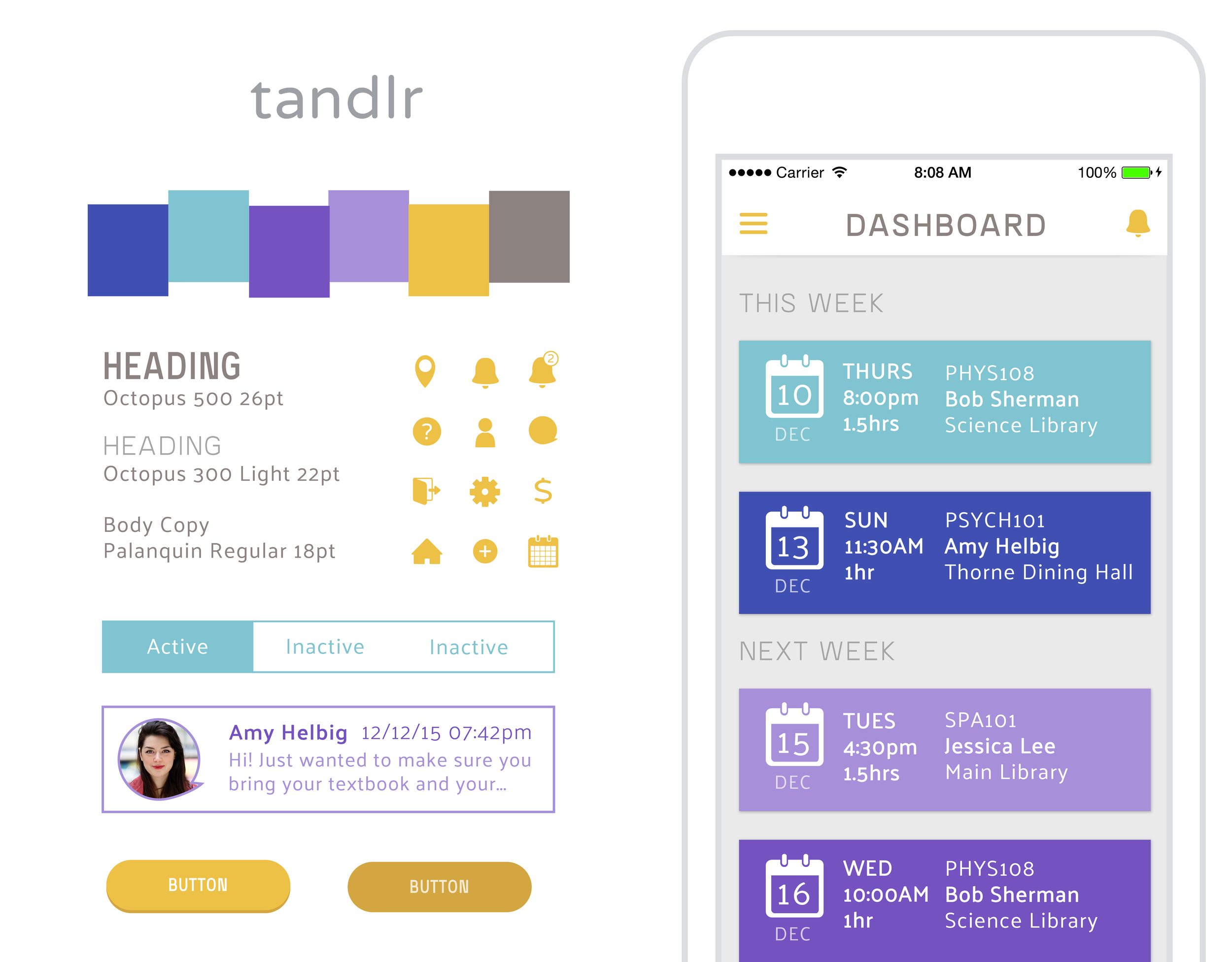
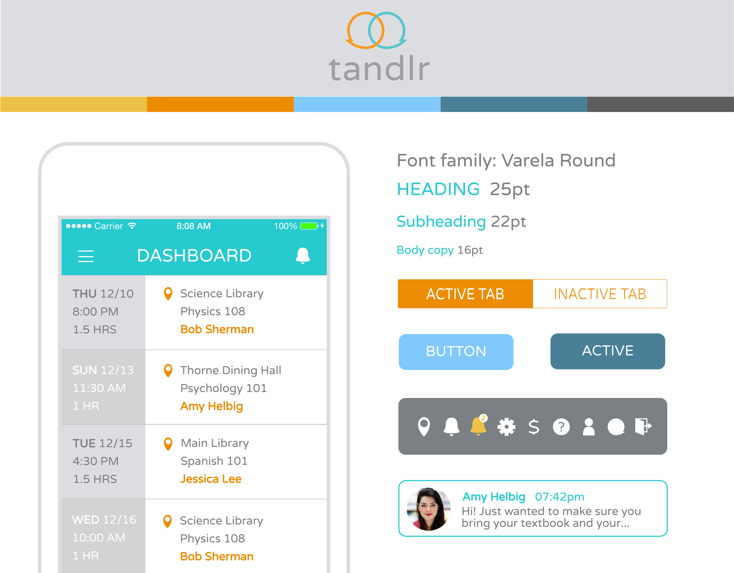
From the analysis, I compiled our research to present three possible style trajectories.
Step 2: FIRST ROUND OF DESIGNS ⏱
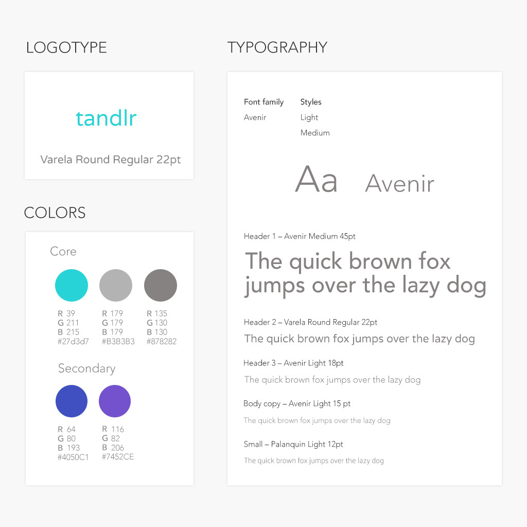
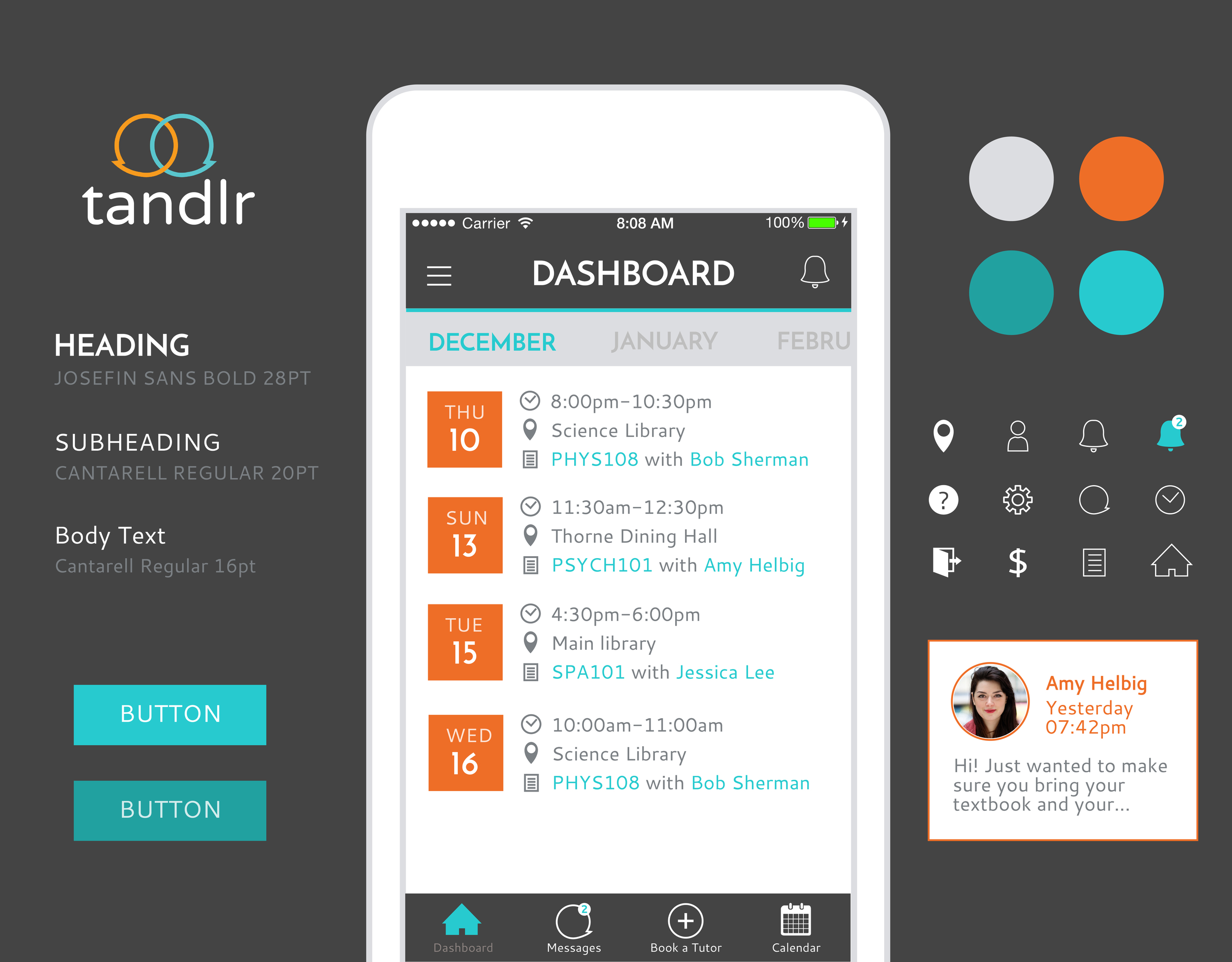
Following client feedback on my style exploration, I consolidated elements from the bold, modern style and the bright, youthful style to create an updated look for tandlr.
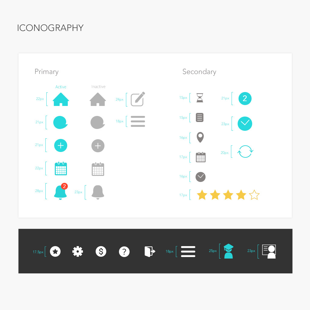
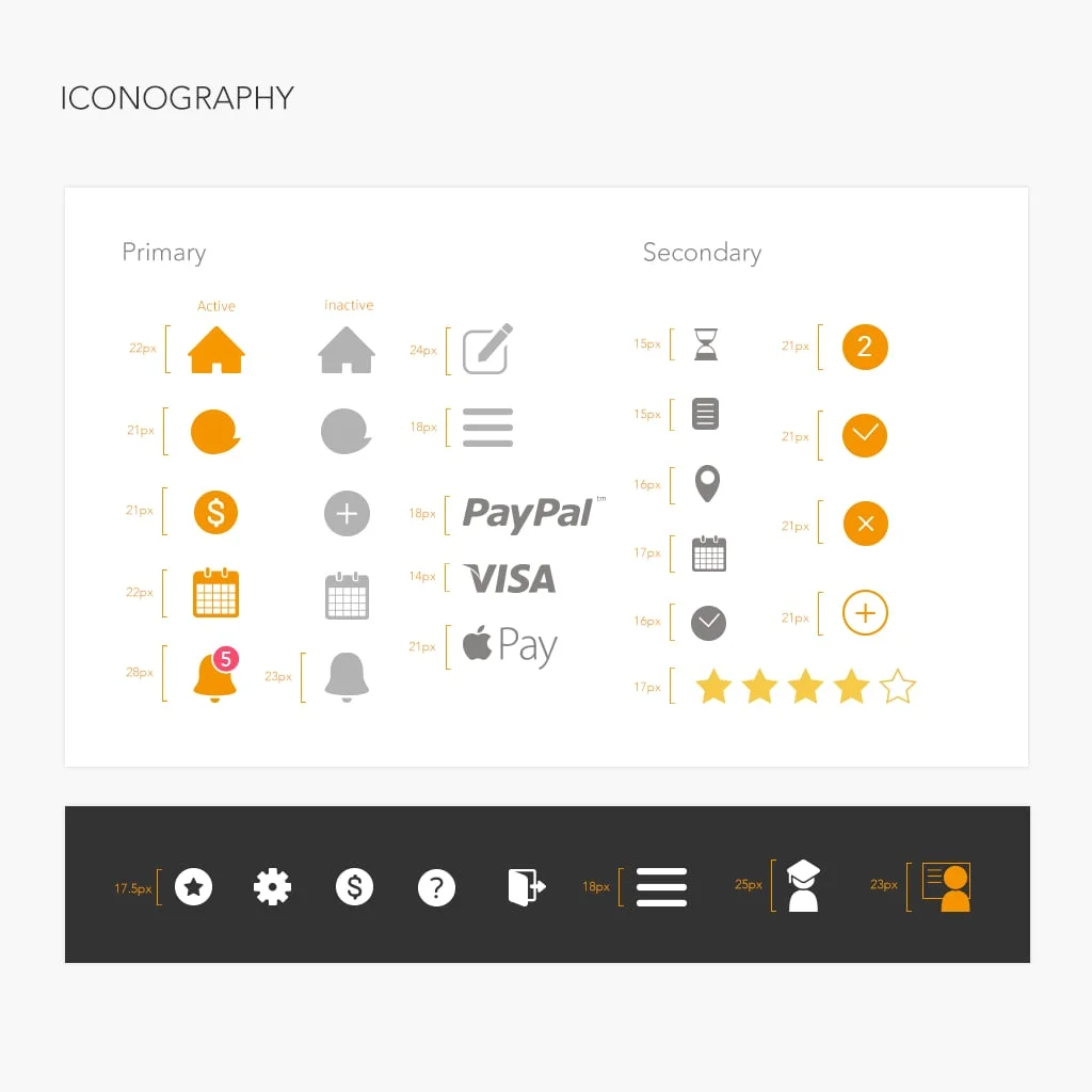
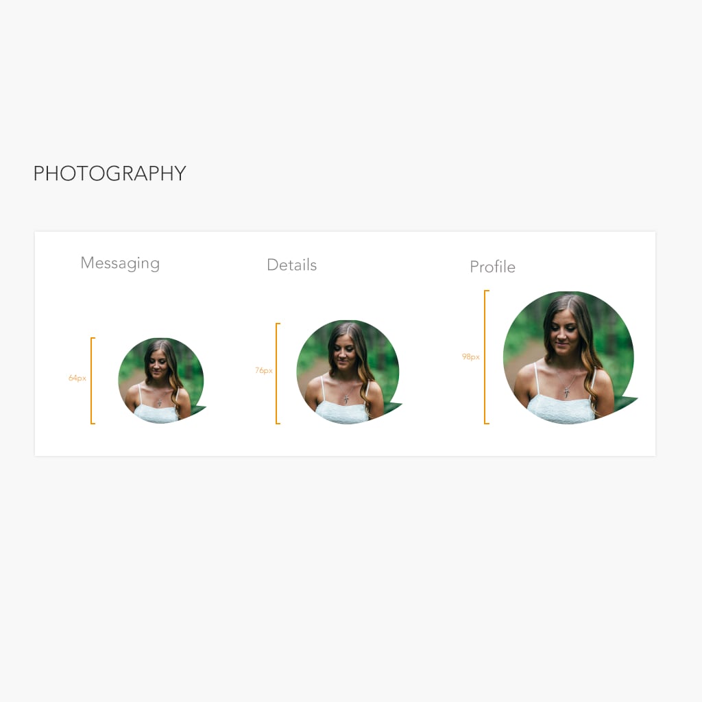
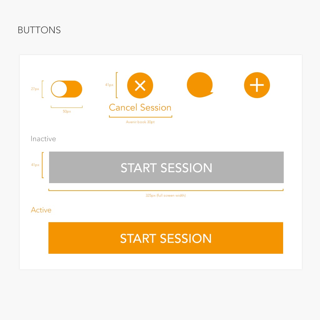
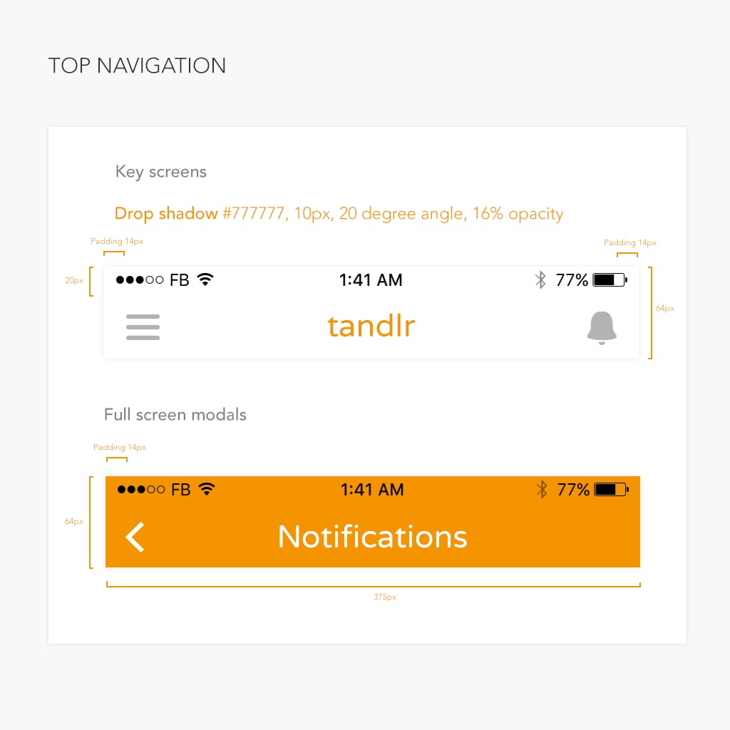
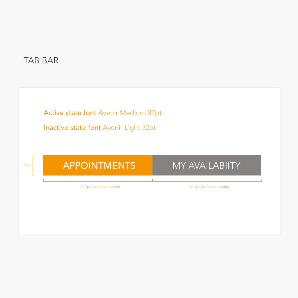
To distinguish between the student and tutor portals, I used orange to create a warm color scheme for the tutor portal and teal to create a cooler color scheme for the student portal, with custom iconography.
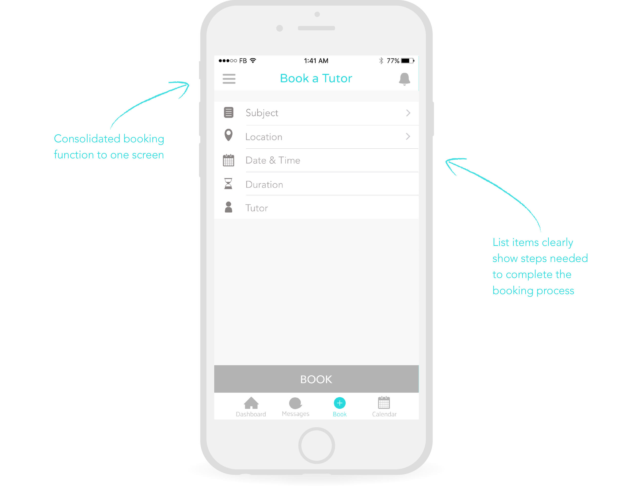
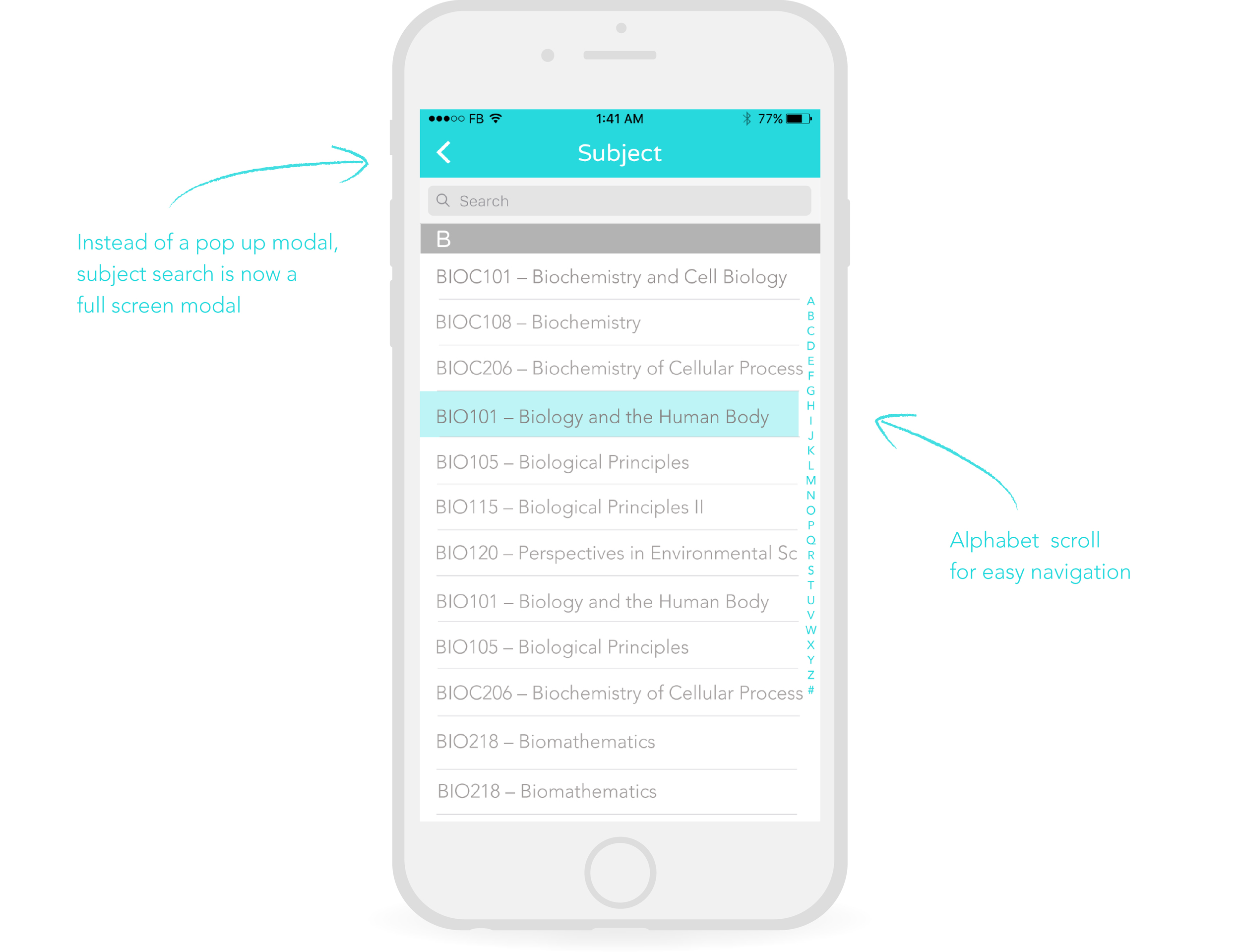
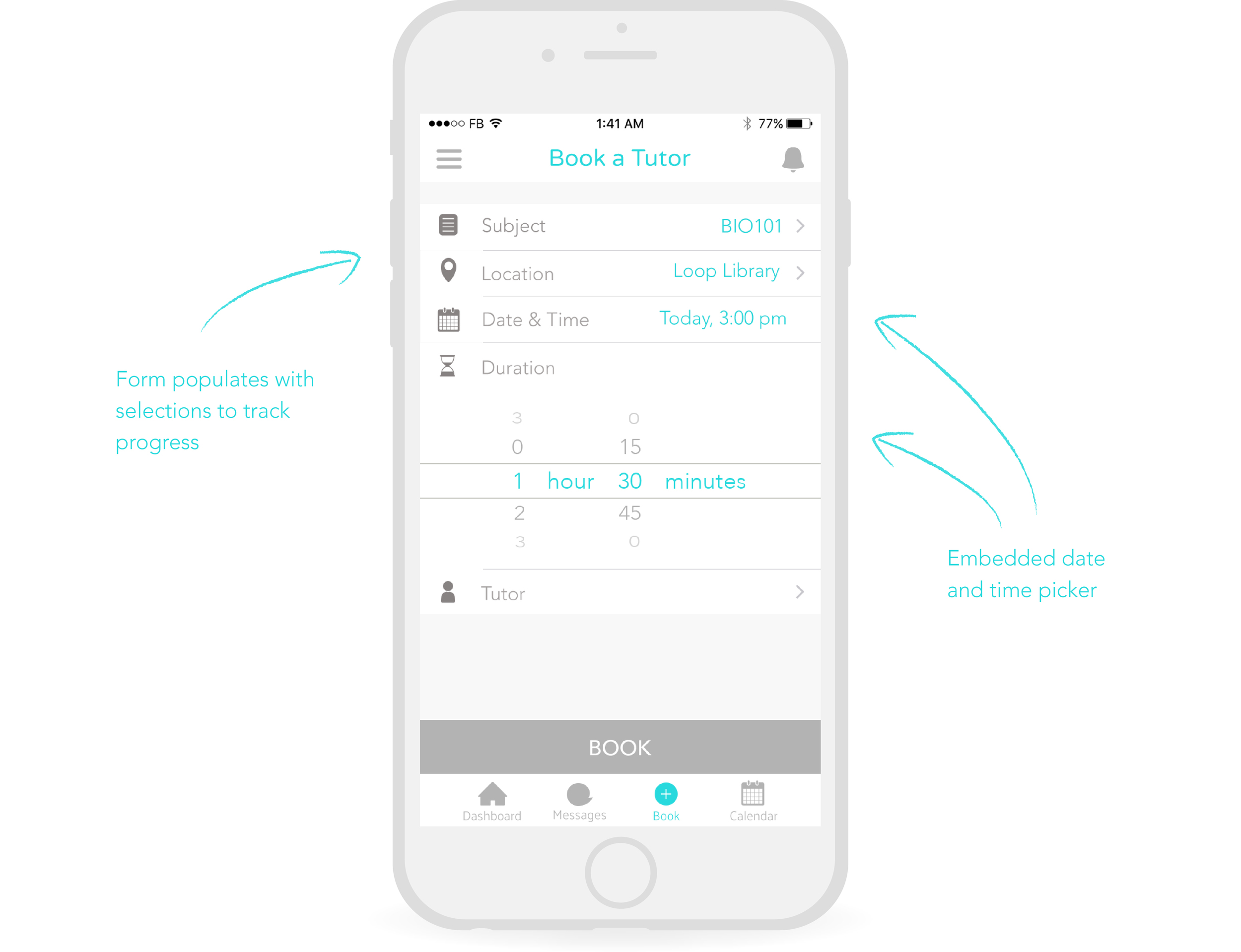
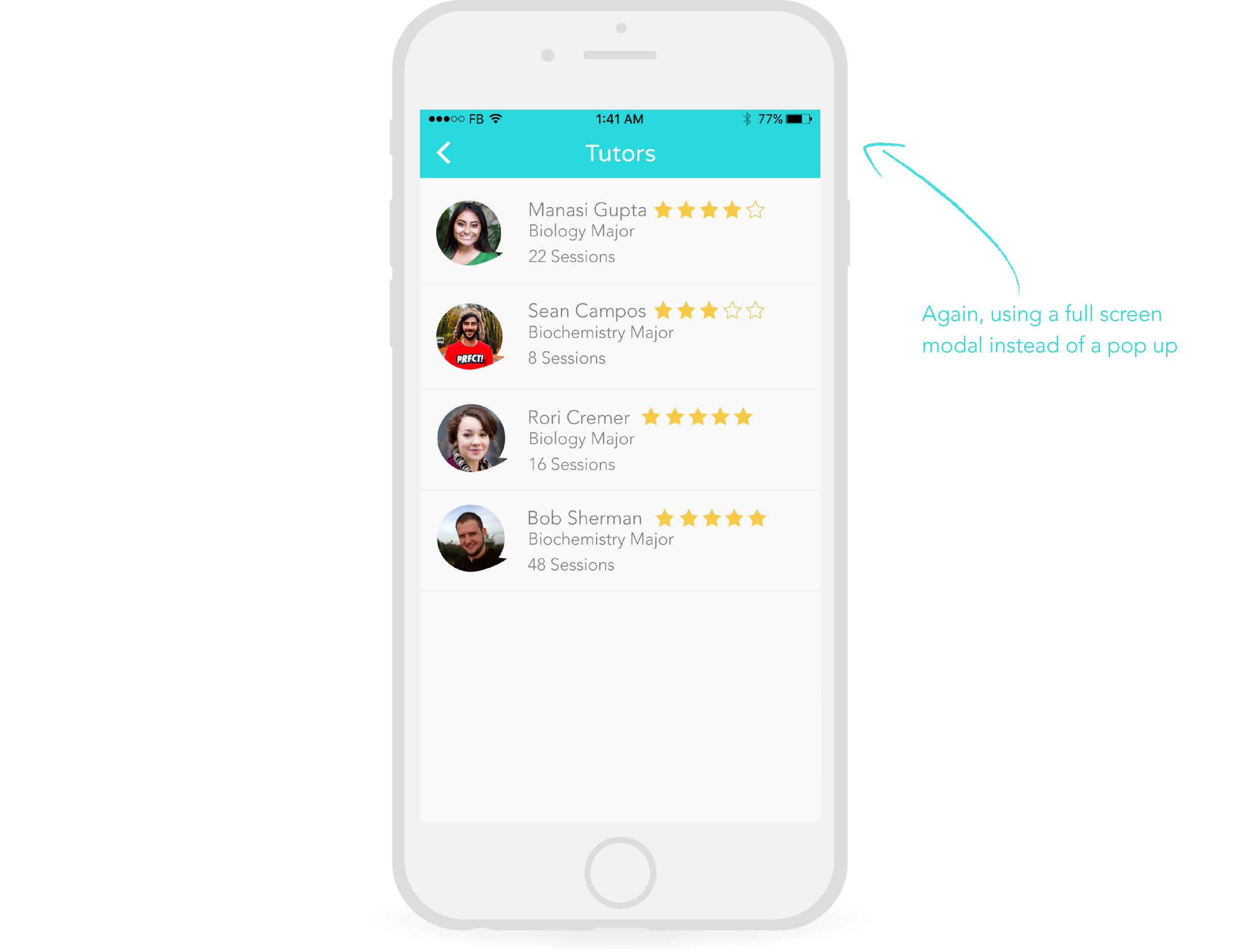
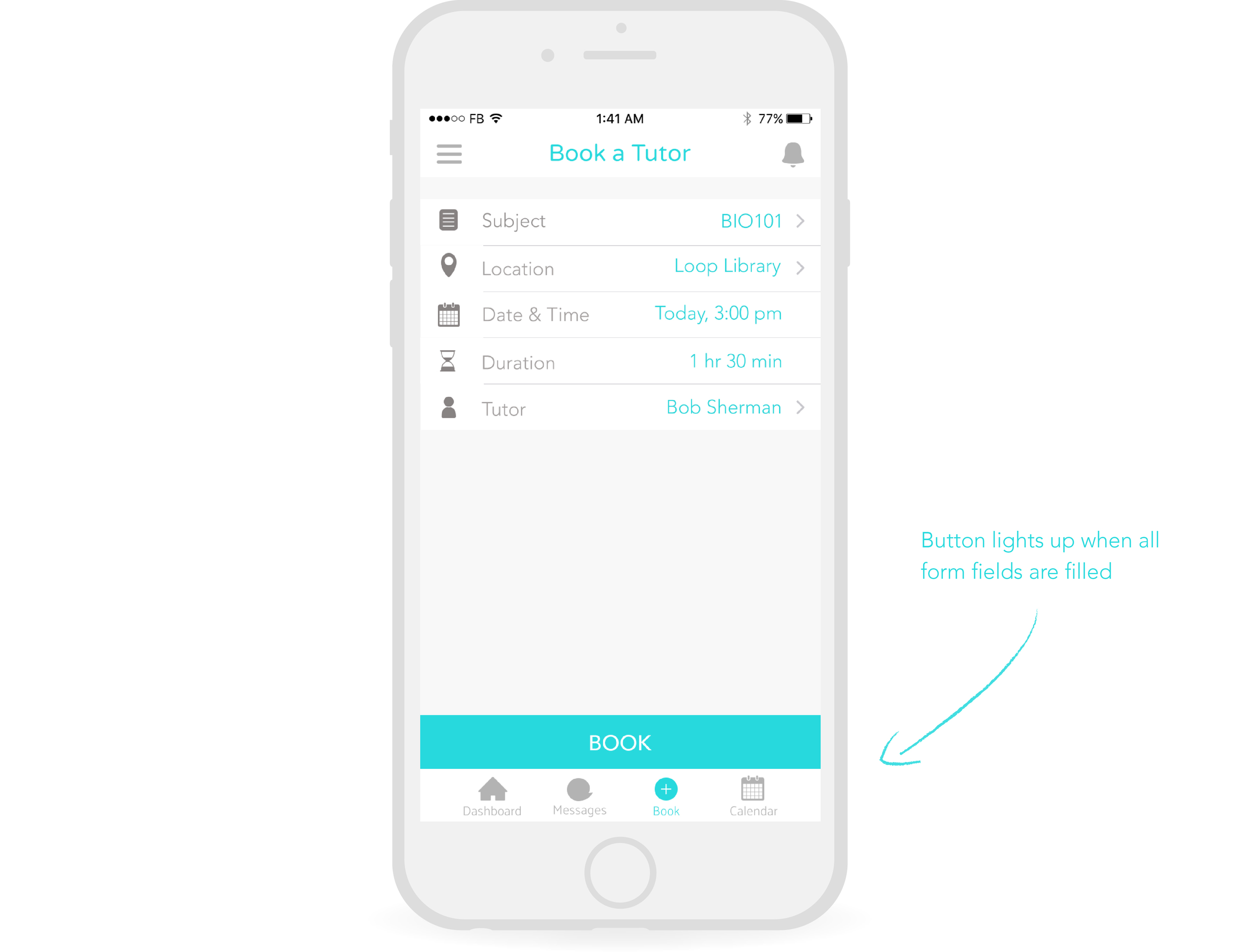
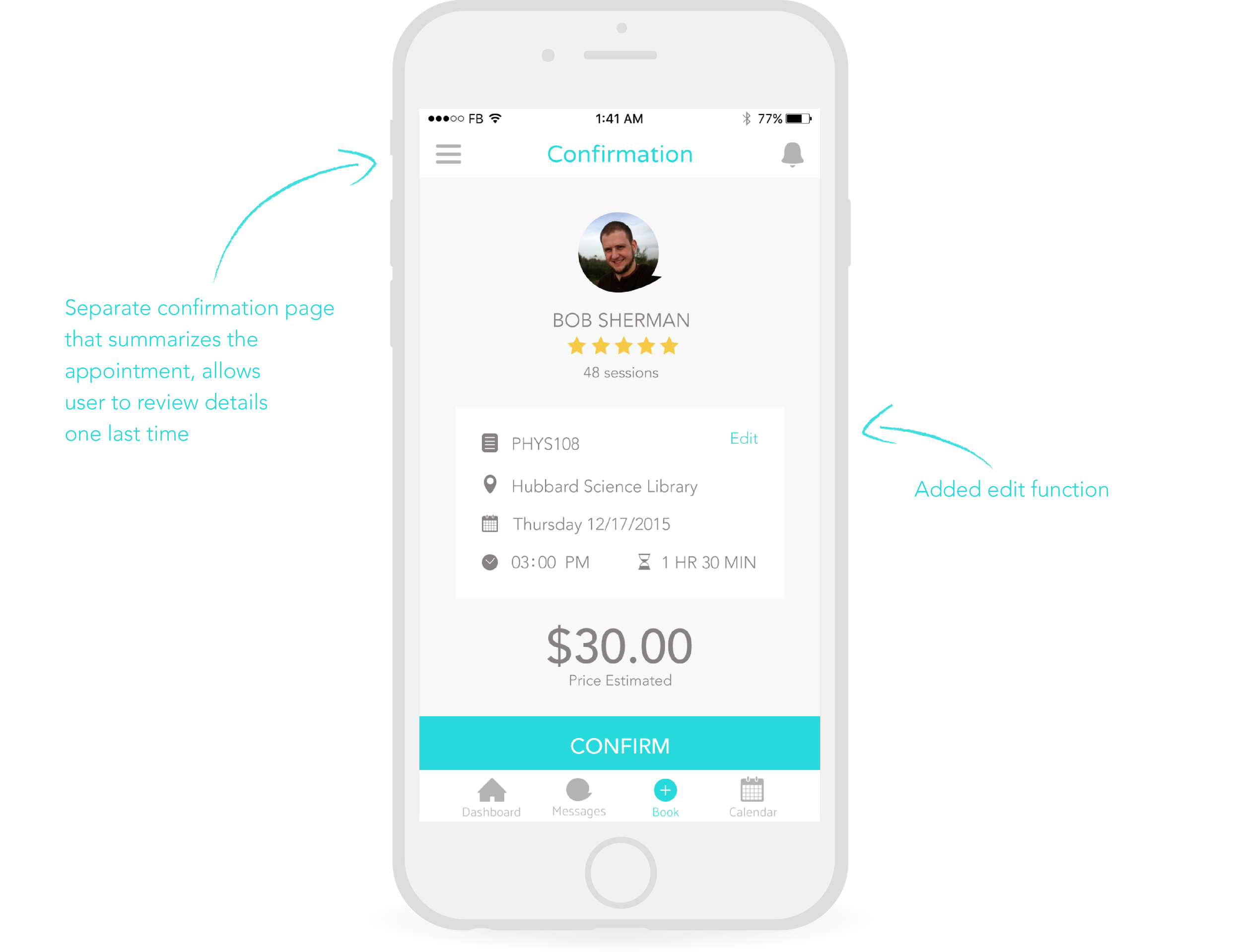
STep 3: UX REDESIGN OF BOOKING PROCESS 🖊
At this point in the project, I identified key area for improvement in the client’s product. The original wireframes we received depicted the tutor booking process with a series of pop up modal overlays, a common web pattern that diminished the mobile user experience. I proposed an updated, mobile-friendly design:
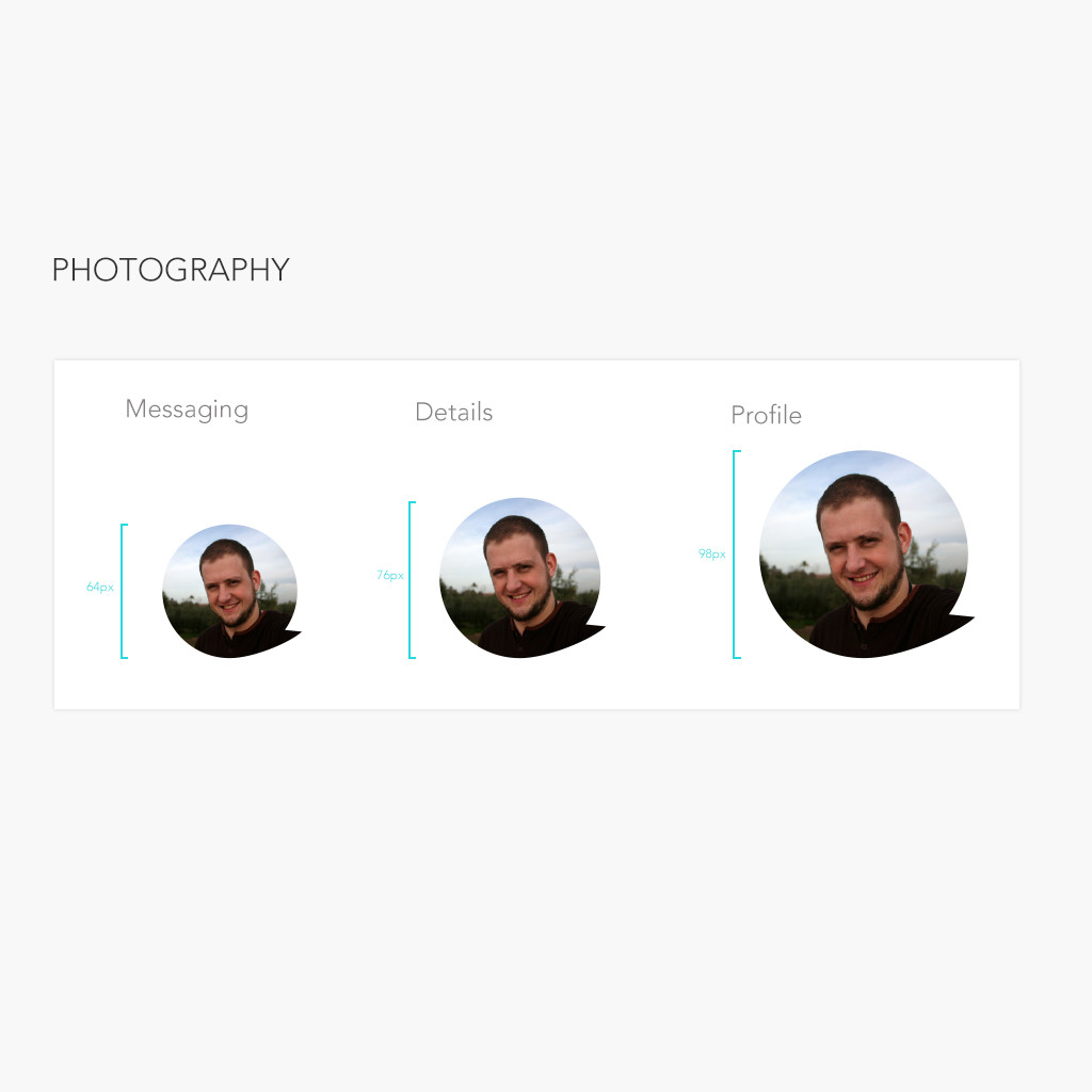
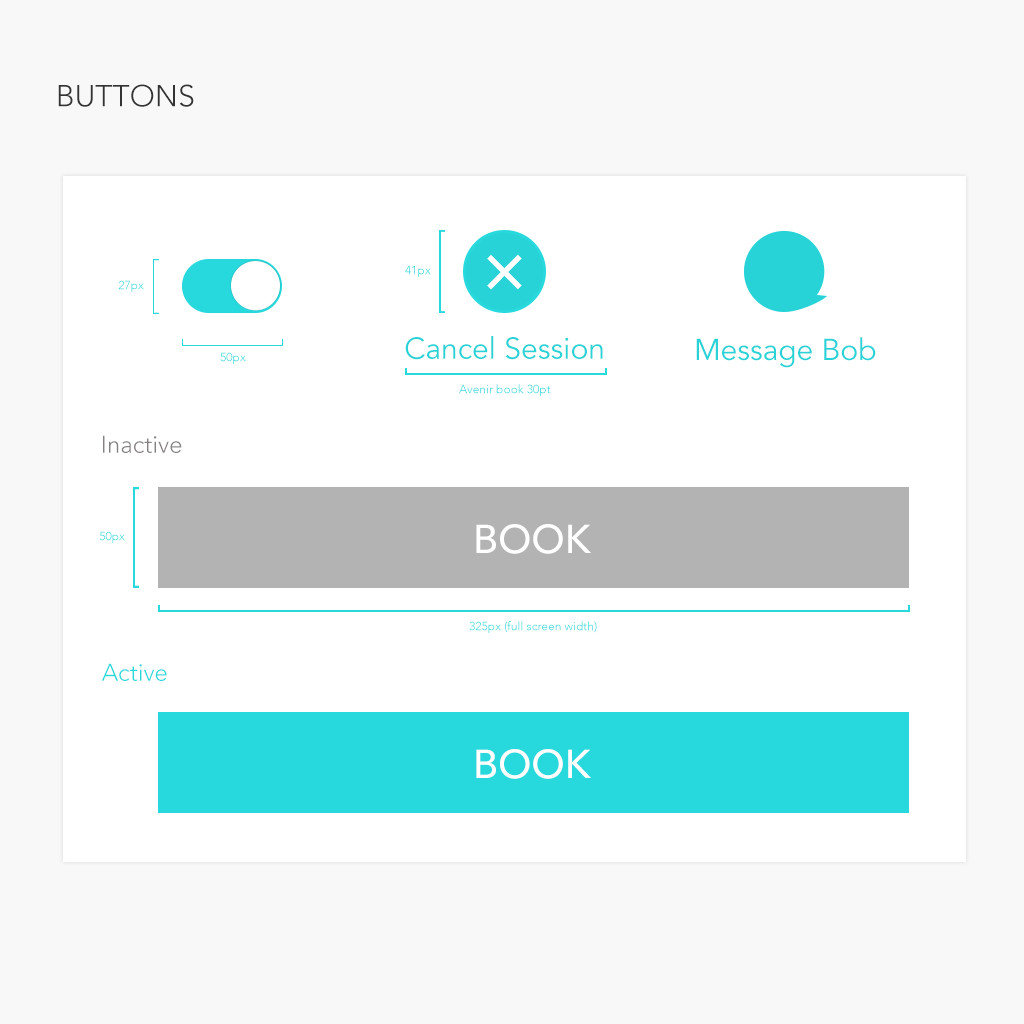
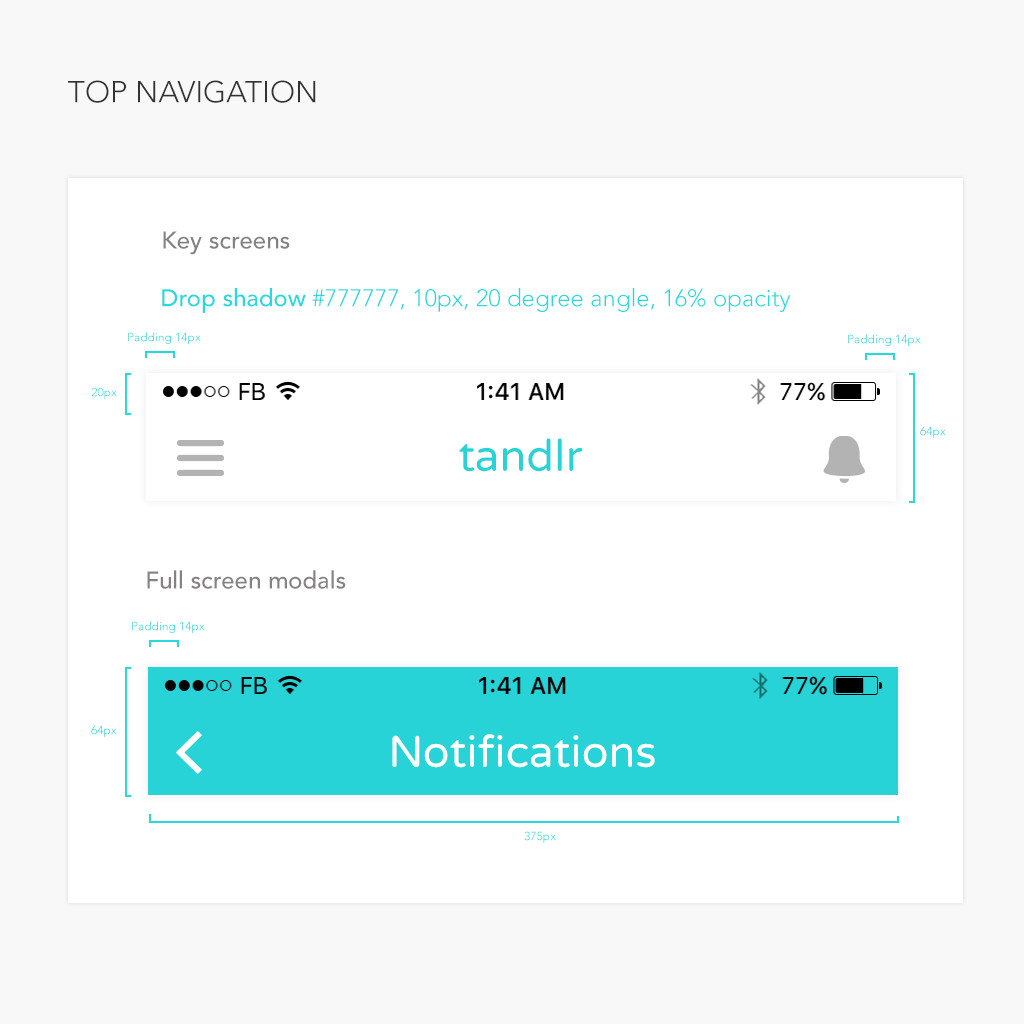
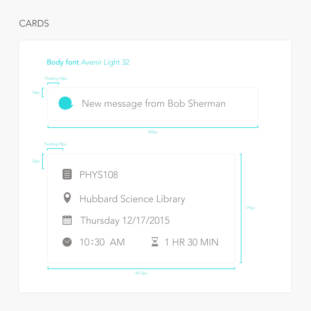
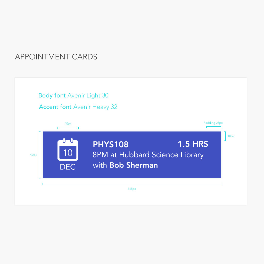
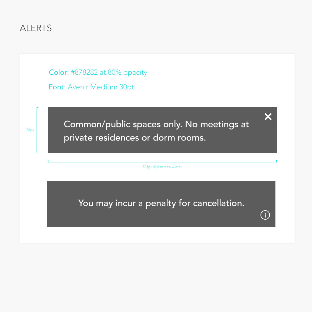
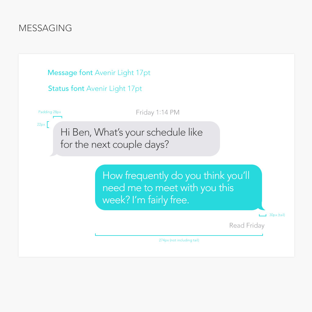
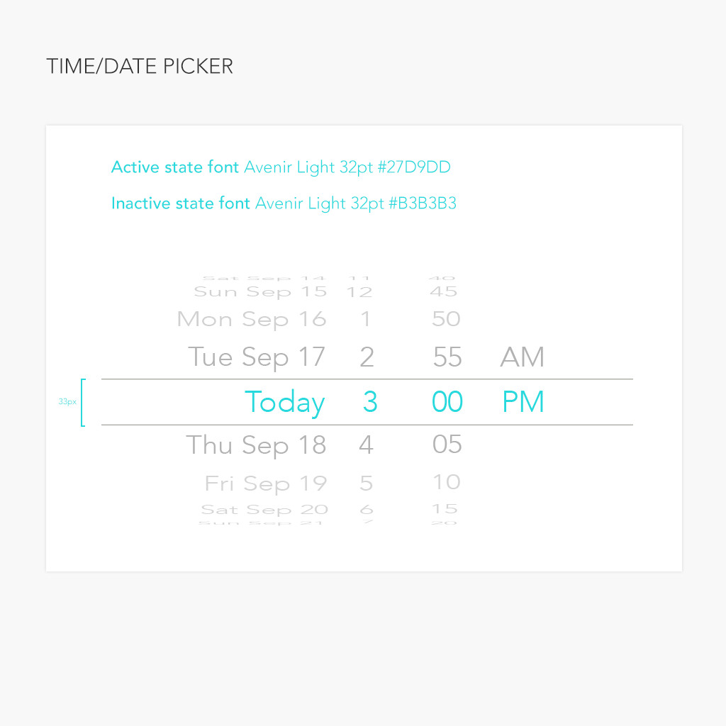
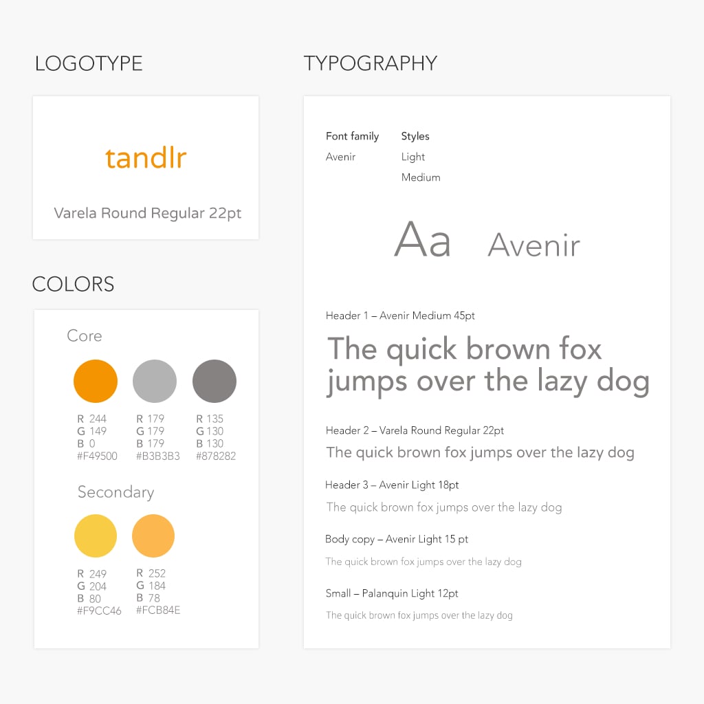
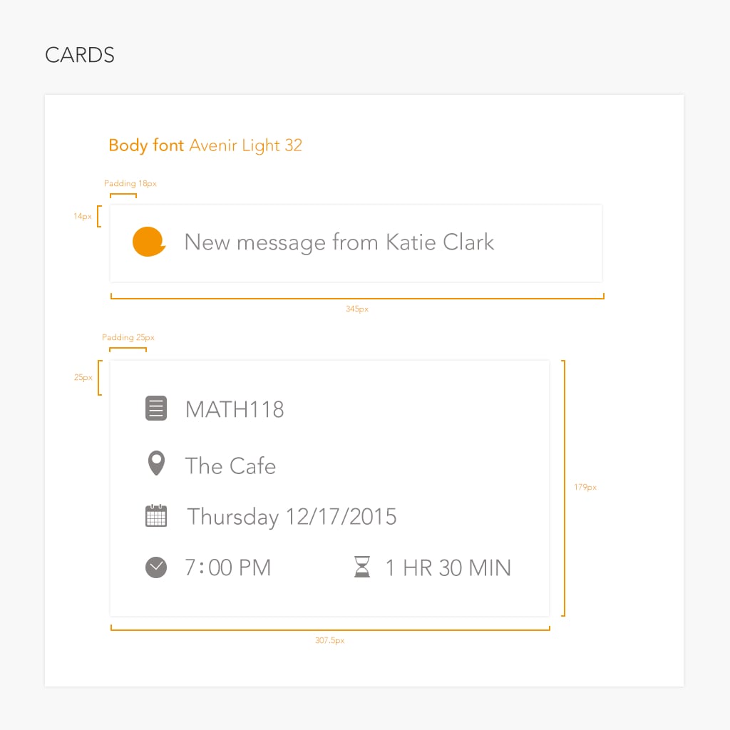
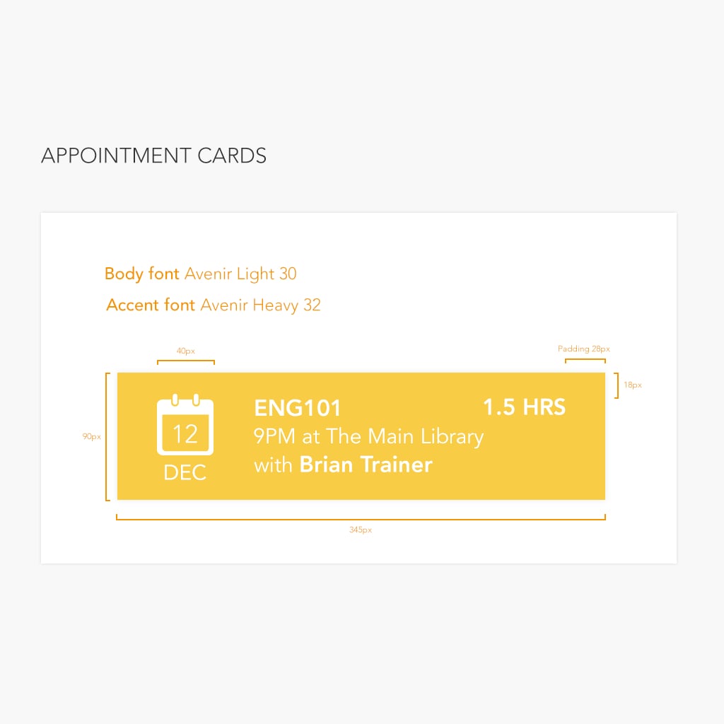
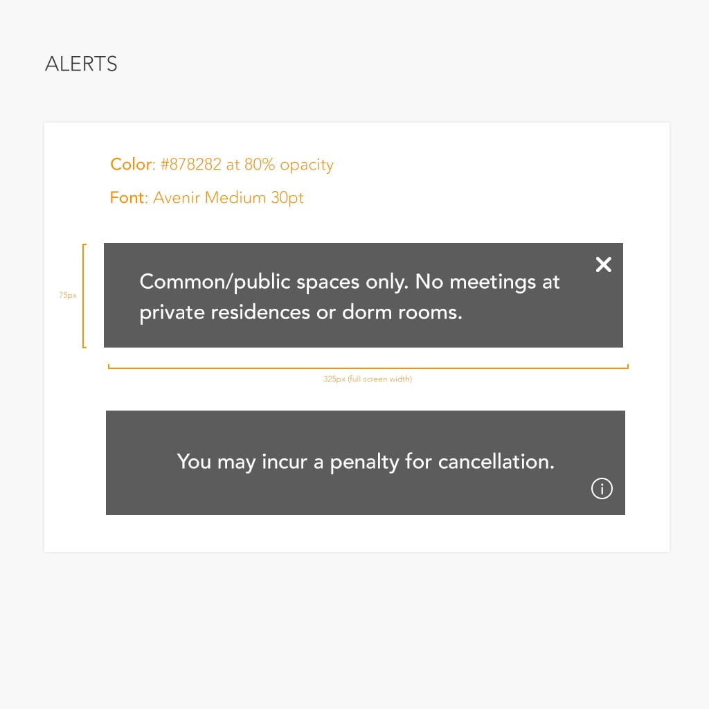
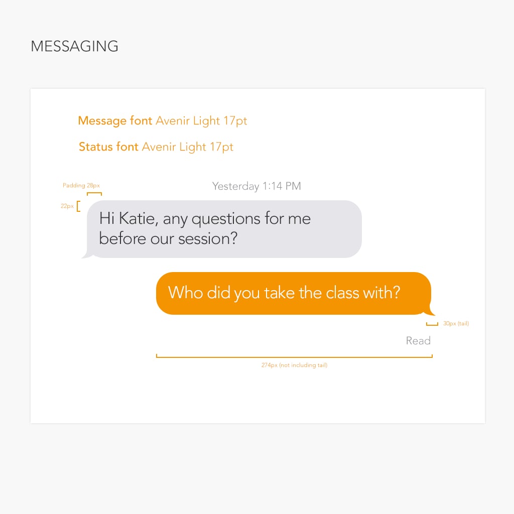
Finally, I provided two separate style guides for the student and tutor portals.